The client wanted its website to feel more like a true digital magazine. The existing experience did not reflect the publication’s editorial design, and its page layouts were not flexible enough to handle the changing mix of stories published each month.
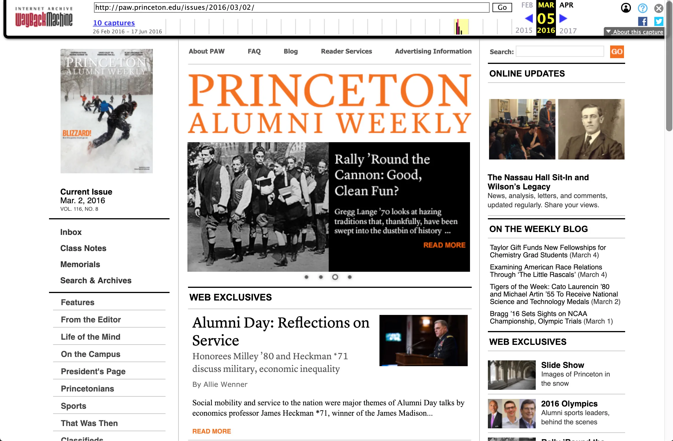
The new site also followed an unusual publishing model. Current issue content would make up the primary website experience, while older stories would move into the archive. Rather than behaving like a continuously growing news site, the website needed to present each issue as a cohesive digital publication.
The Challenge
The amount and type of content changed from issue to issue. One month might include several major features, while another might rely more heavily on shorter stories, departments, or supporting content.
The design needed enough flexibility to accommodate those differences while still producing balanced, intentional layouts. Editors needed confidence that the site would remain visually strong regardless of how many stories appeared in a section.
The project also exposed a broader problem in our responsive design process. On earlier projects, clients often expected static mockups for every page at multiple screen sizes. That created a large amount of repetitive design work and left too little time for iteration.
It also created a gap between design and development. Static layouts could show how a page looked at a few fixed sizes, but they did not fully explain how components should behave across all the widths between them.
The Approach
I redesigned our responsive workflow around content priority, reusable interface patterns, and an HTML prototype.
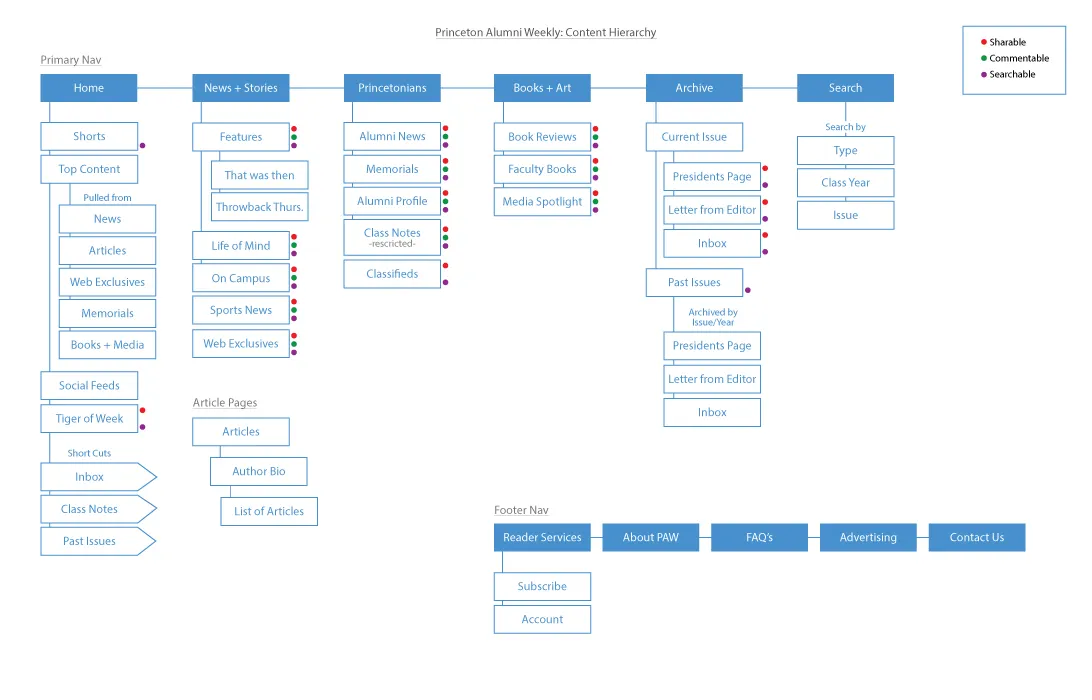
Instead of beginning with a full visual design for every page, we first mapped the site’s information architecture and navigation. We then created content-priority wireframes that showed the hierarchy of information on each page without committing too early to a fixed layout.
I developed a content inventory that documented every possible block across the site. Blocks with similar purposes were grouped into shared types, allowing us to identify the reusable patterns needed to support the full editorial system.
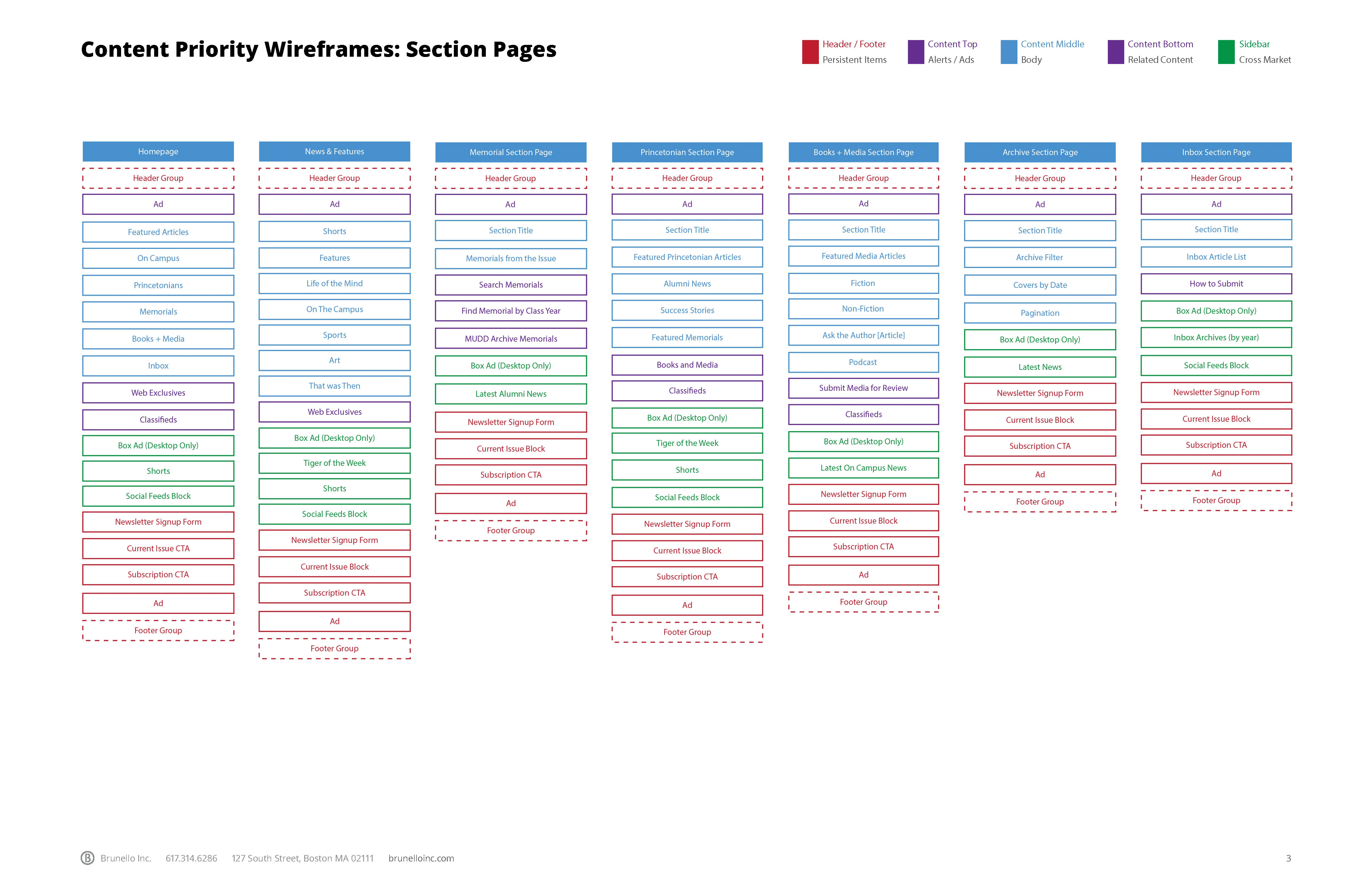
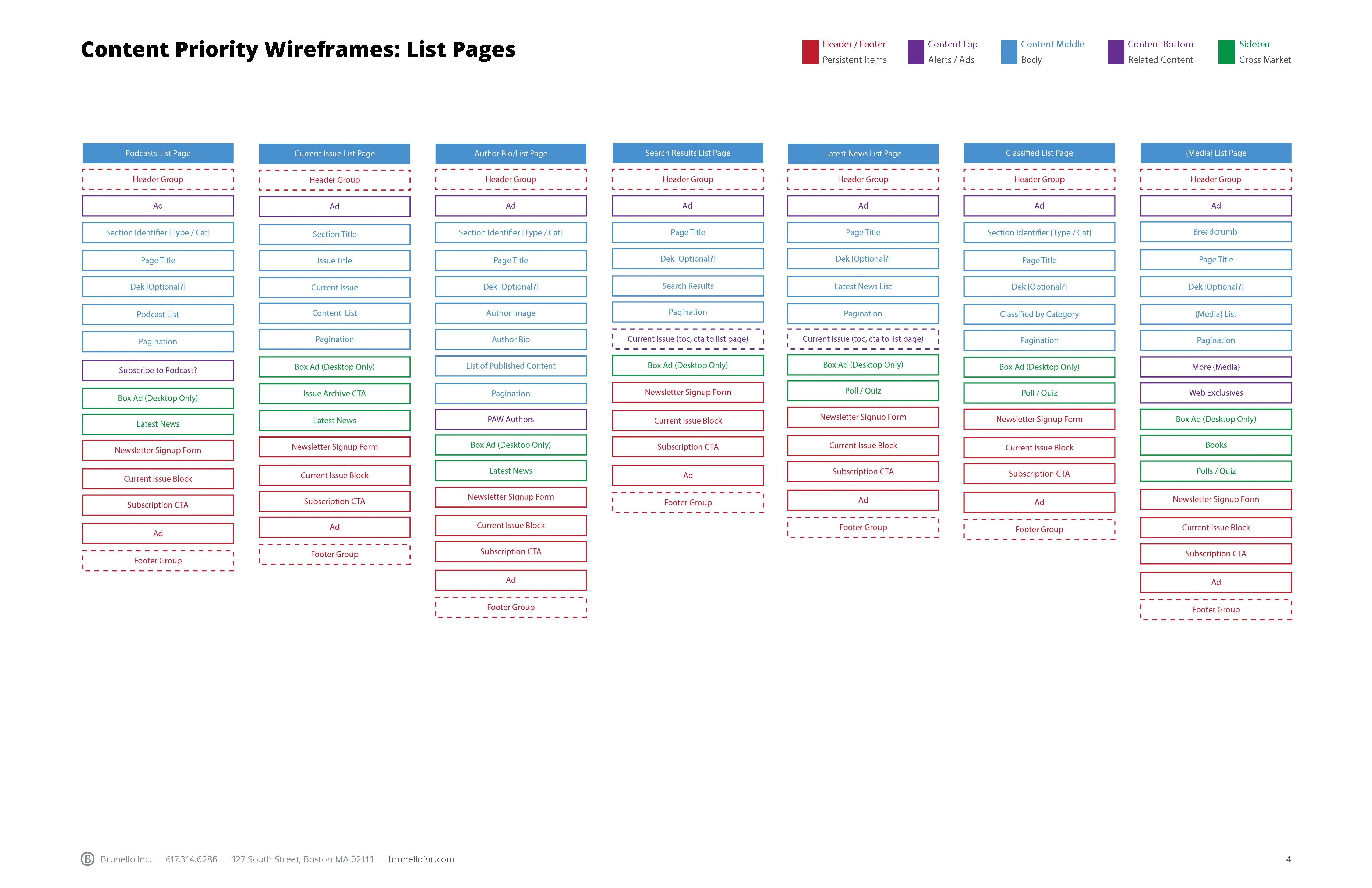
This gave us a framework for scaffolding every page type before designing each one in detail.
Designing for Variable Editorial Content
Feature lists were one of the most important patterns in the system. Their layouts needed to work with different numbers of articles without producing awkward gaps or weak compositions.
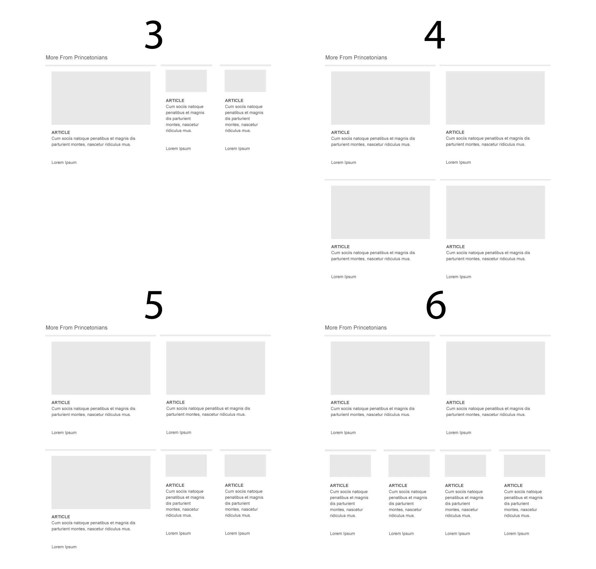
I sketched and tested multiple variations that changed according to content volume, story priority, and available imagery. Rather than giving editors a single rigid layout, the system offered controlled options that maintained hierarchy and visual balance.
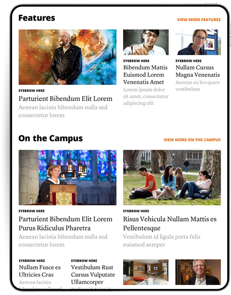
The layouts could support a lead feature, secondary stories, image-heavy groupings, or simpler text-based lists while remaining consistent with the broader publication design.
This allowed the editorial team to respond to the content of each issue without needing a developer to redesign the page every month.
The Responsive Design Process
I changed how our team handled responsive design by reducing the number of static comps and moving more of the design process into the browser.
Full mockups were reserved for the pages and layouts that introduced meaningful visual decisions. For the rest of the site, I created reusable HTML components and styles that could be combined to produce the required page types.
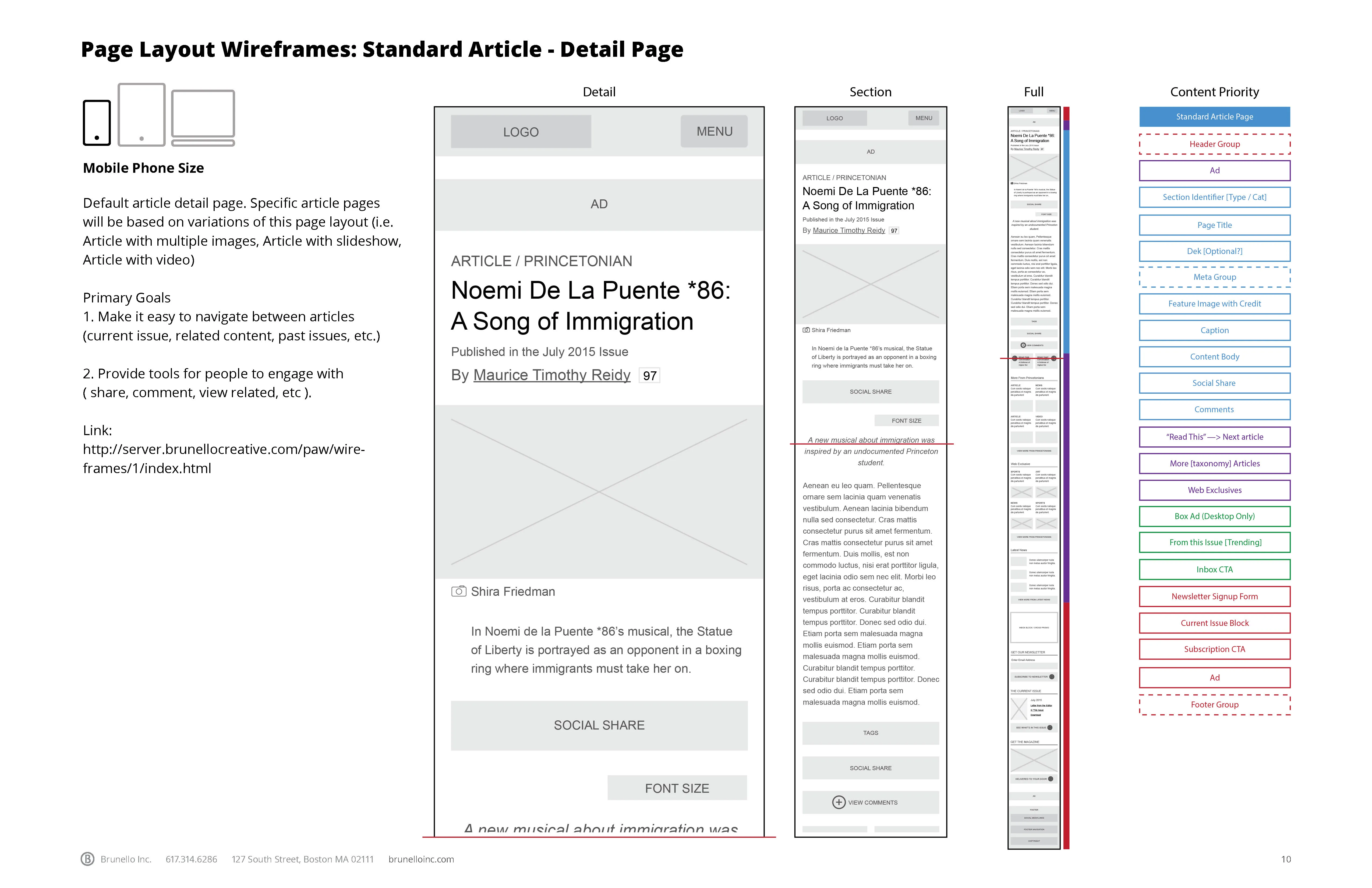
This allowed the client to review real responsive behavior rather than separate snapshots of desktop, tablet, and mobile layouts. It also made it easier to identify issues with content length, image proportions, typography, and component relationships earlier in the process.
The approach reduced duplicated work and gave us more time to improve the design itself.
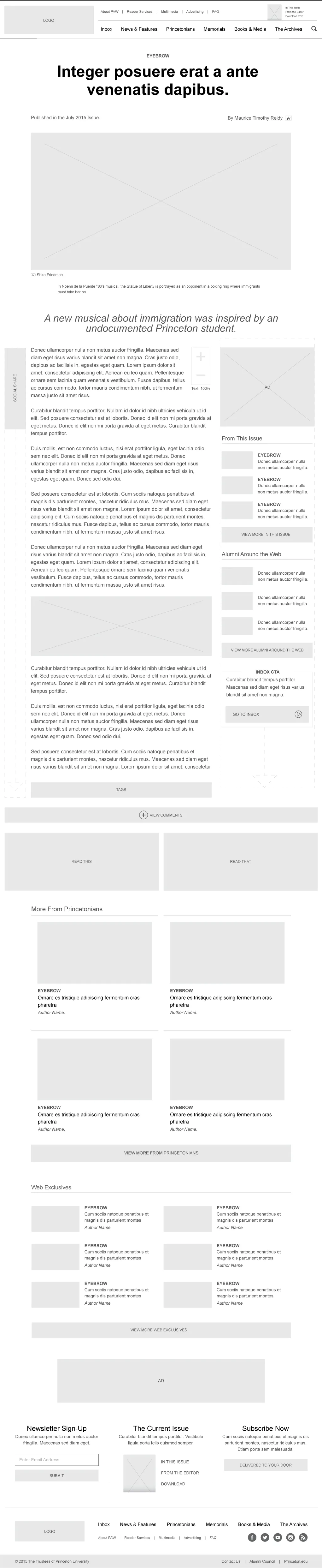
The HTML Prototype
I created a component template system to build a working prototype of the site. The completed prototype included 41 pages built from approximately 30 core components and about 100 documented variations.
The prototype served several purposes:
- It demonstrated how the layouts adapted across screen sizes.
- It allowed us to test realistic editorial content.
- It helped the client understand how shared patterns worked across the site.
- It exposed edge cases before CMS integration.
- It provided production-ready frontend code for the final Drupal build.
Rather than discarding the prototype after design approval, we reused its components, styles, and responsive behavior during implementation.
The Result
The final system gave the publication a stronger editorial identity and enough flexibility to present each issue with an intentional layout, regardless of content volume.
The project also changed how our team approached responsive design. Moving from page-by-page static mockups to component-based HTML prototypes created a more efficient connection between design and development.
That process reduced repetitive work, supported more meaningful iteration, and produced a frontend foundation that could move directly into the final Drupal site.